Successful brands have all found a common thread to their communications: simplicity. To been seen and heard above the daily clutter and clamour and gain instant recognition is the unifying goal of all brands.

It’s not a new thought given it’s summed up in a quote attributed to Leonardo da Vinci, namely ‘Simplicity is the ultimate sophistication’. In a world of marketing clutter, bold brands apply this approach consistently across all their communication to convey a clear differentiated message which connects with their customers.

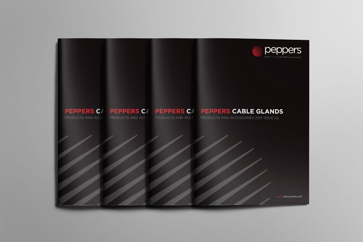
When we first spoke to Peppers, a company who set the international standard in the cable glands industry, it was clear continued growth had led to a complicated brand and message. Taking a ‘simplicity’ approach was what was required to re-define who they were, what they did and the relevance of that to their customers.

simplicity of message and identity

“More than just a visual refresh, this has been very much a strategic branding exercise. Peppers has gone through significant change since its inception and this rebrand was commissioned to bring the firms brand identity into line with its industry leading product and service proposition.

The process identified and defined core areas of service advantage which can sometimes be overlooked in favour of straight price comparison. However, it is the totality of our offering which truly sets Peppers apart within the marketplace and supports the Company’s hard earned ‘best value’ rather than ‘lowest price’ reputation.”

Managing Director – Peppers Cable Glands

The resulting new ‘Peppers Globe Logo’ brand identity is striking in its simplicity, but all the more impactful because of it. Designed at the client’s request to retain echoes of the old identity, it also needed to reassure customers that whilst the business was developing and evolving, it wasn’t losing or moving away from the quality, service and delivery it has become renowned for.

Indeed, the distinctive new ‘End-to-End Performance’ brand positioning underpins the focus on product delivery, industry expertise and the customer journey, literally from start to finish.

To find out more about how WDA’s unique brand marketing approach can help your business grow please get in touch with our Business Development Manager Anna on 01332 372 728 or e-mail directly on anna@marketing.dev-wda.com

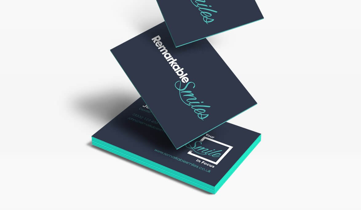
Working closely with the team at local dentist group Remarkable Smiles (formally Central Dental) WDA’s strategic creativity process identified that people aren’t really scared of going to the dentist, but of what the dentist may have to do to them. Not surprisingly those who visit the dentist regularly need far less dental work than those who only go when they’ve got toothache.

WDAs drive behind the rebranding to Remarkable Smiles (which goes much deeper and wider than just the name or visual identity) is that recent changes in dental care (Direct Access) allows trained dental nurses to see patients rather than have to wait to see the dentist, putting the focus on ’prevention rather than cure’, and increasing the availability of appointments.

Remarkable Smiles Brand Identity - WDA

Over the coming weeks the central Derby and Alvaston  practice will undergo their visible transformation from Central Dental to Remarkable Smiles with several new and innovative health and wellbeing services also being offered under the new brand and a customer service approach aimed at getting smiling on the inside as well as the outside.

The goal being to encourage more people to visit the dentist regularly, therefore less dental work needing to be done with each visit. This is just the start of the local entrepreneur (and dentist) Dr. Amit Koshal’s long term ambition to fundamentally change attitudes towards visiting the dentist for the better, forever… and who wouldn’t smile at that?

Remarkable Smiles Brand Identity - WDA

Remarkable Smiles Brand Identity - WDA

To find out more about how WDA’s unique brand marketing approach can help your business grow please get in touch with our Business Development Manager Anna on 01332 372 728 or e-mail directly on anna@marketing.dev-wda.com

WDA are again delivering a number of FREE Marketing and branding audits during January 2017.

This is your opportunity to discover how a brand driven marketing apporach could help drive YOUR business forward in 2017. The sessions are designed to be fairly informal and flexible.

Maybe you want a FREE honest professional opinion of your existing or planned marketing programme, or perhaps you would like advice on a specific area. This is your opportunity to pick the brains of our experts over a cuppa and (hopefully) leave with a fresh perspective and boosted enthusiasm about your branding and marketing plans – a great way to kick off the new year!

Places are limited to book please contact Anna Buonaguro at: anna@marketing.dev-wda.com

We’ve seen many top brands mining their past, with ‘The Co-op’, ‘Guinness’ and more recently ‘MasterCard’ having returned to form with logos each echoing their 1960’s predecessors, but all for very different reasons.

Heritage and history are valuable commodities for any brand; a history is distinct and ownable. They can be used to re-dress a business to change the public’s perception. Although there is now a climate in which any company with a decade under its belt is proudly declaring its provenance, in good branding, heritage is more than a battle of ‘who has been around the longest’. Authenticity is what roots itself in the consumer’s mind. No wonder many businesses are chasing a ‘heritage brand’, trying to unearth their own engaging story. Storytelling gives a brand a platform to speak to us on emotional level, a recent article in Wired even argues that a well spun tale side-steps our reasoning and normal defences.

For a brand like The Co-op this sort of re-brand seems  like an obvious move.  In many ways – seeking to resuscitate a tarnished reputation – their hand was forced. ‘North’ the design studio behind the re-brand surmises as “evoking nostalgic memories of local shops and dividend stamps”, in this way it’s is harkening back to a fondly remembered time. It is not as much about telling ‘it’s own story’, but rather trying to buy into another. The Co-op is using its heritage to once more try to position itself and it’s values to an idealised past – where no one locked their door and the postman wore shorts. As it happens The Co-op has a longer and richer heritage it can mine, dating back to the early 19th Century, but that doesn’t align with the message and values that they want to project now, but in reality no one cares about a brand’s uncurated history. What matters is story telling. In essence, branding is about sowing seeds in the imagination.

A good example of this is the recent Guinness rebrand, working with an illustrator who had drawn their iconic Guinness harp of 1968. The logo evokes notions of craftsmanship. It is textured and complex and is a breath of fresh air going against the current trend of minimalist design. Compare it, for example, to Mastercard’s recently unveiled logo  – minimal to the utmost. Guinness’ logo is distinct and physical, the hand process is trying to reconnect with a 250 year old brand. The beer market finds itself in a time where every label is emboldened with the word “craft”, Guiness’ re-brand is about differentiation they are attempting By contrast, Guinesss are trying to tap into  the idea of traditional craftsmanship. The same idea is behind the medieval heritage of Stella Artois’ Chalice design.

In a saturated market many brands are staking their claim as ‘the originals’, using their heritage as a tool to reposition themselves with storytelling. Heritage is an important factor to establish a consumer trust, but it is no longer about who planted their flag first. A trustworthy brand is not simply the one that has been around longest but rather the one crafting an engaging tale, a story that reflects that brand’s values. Today’s motto appears to be, If you don’t have a story these days, make one. In design terms we can safely predict a few more brands drawing upon the hand-crafted imagery, moving away from the clean lines of digital, yet as The Co-op and MasterCard show its not just about rejecting the contemporary ‘flat design’ that surrounds us. Branding appears to have fixed its gaze on ‘heritage’, is this a trend that’s set to continue?

If you need help creating an effective brand for your event or organisation contact Anna Buonaguro onanna@marketing.dev-wda.com

Following a successful pitch, WDA were appointed to help one of the UK’s fastest-growing independent property groups to rebrand and reposition themselves to accommodate major expansion plans over the next five years.

Founded in 1989 as Direct Valuations and known as Shepherd Direct Ltd, the group comprises a comprehensive range of property related services including Estate Agency, Surveying, Risk Management, Lettings, Mortgages and Finance; each with its own brand identity all operating as independent trading divisions from Shepherd Direct’s Nottingham HQ.

The rebrand was part of a group strategy to create awareness for and to cross-sell these complementary divisions to customers by creating a common brand platform and a level of brand recognition to reflect the scale of the organisation which employs over 400 staff and has an annual turnover of £60m.

Referred to internally for many years as SDL, the choice to adopt the SDL prefix to unify the businesses was made strategically to simplify the complex group structure that existed within Shepherd Direct.  This simple prefix has also allowed acquisitions to quickly adopt the new group identity whilst retaining historic recognition and brand equity.

Whilst moving away from Shepherd Direct Ltd to the SDL acronym supported the desired new brand architecture, we wanted to retain a link to the decades of history, heritage, and core brand values of the original businesses.

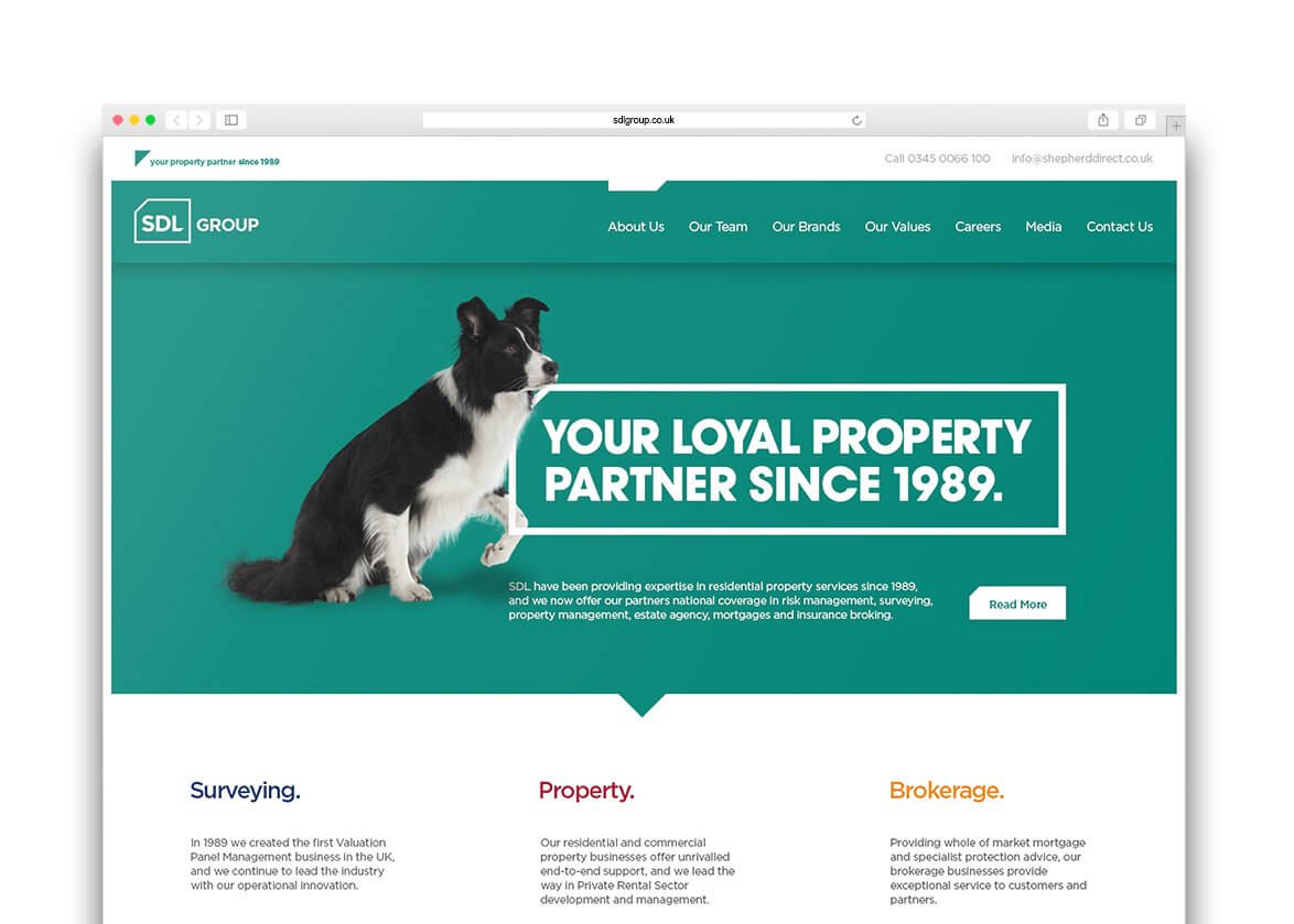
SDL Website Design | Branding Derby | WDA

“During initial discussions it became clear that creating lasting partnerships was at the heart of what Shepherd was all about. Words like trust, honesty, loyalty and commitment kept cropping up time and again when talking to senior members of the team and the board.”

Said WDA’s Lee Waterhouse

“These words are not ones you might automatically associate with this sector, but are certainly highly desired by our audience, and were qualities which we felt should definitely be a part of our new brand story.”

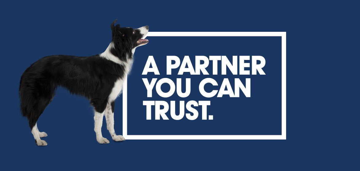
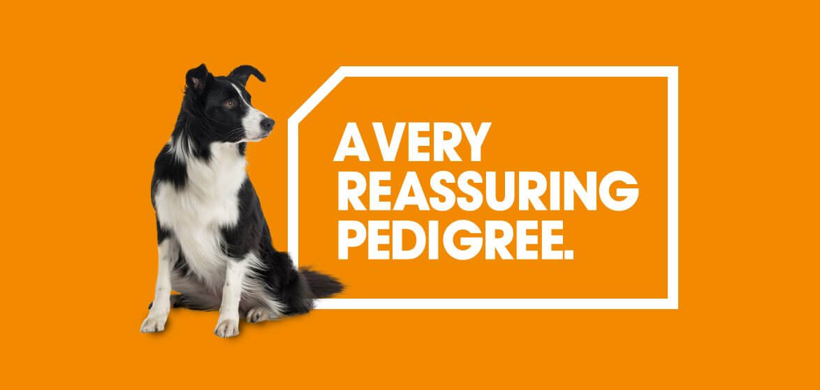
That brand story came to life with the birth of ‘Shep!’, our trusty Border Collie which now sits at the heart of the new brand and has been adopted as the SDL mascot, creating a visual link to the previous name.

The traditional companion of the Shepherd; Border Collies are considered highly intelligent, hard working, and very loyal animals, famous for  herding and protecting their flocks. In just the same way, SDL businesses direct (advise) their valued customers whilst helping them protect their financial interests and investments. In addition the breed has a very characterful personality and is incredibly expressive, enabling us to convey lots of emotion within the brand and its marketing communications.

Apart from giving marketing a broad canvas and lots to work with, Shep and the new branding gives SDL a strong platform for growth and a unique brand differentiator within its market. Since the rebrand expansion is happening at a rapid pace. SDL has already gone on to acquire CP Bigwood, Graham Penny and most recently Humphreys of Chester, the new brand structure allowing these businesses to ‘hit the ground running’ under the new SDL name.

You can hear group Commercial Director, Rob Clifford discussing the brand here.

To find out more about how WDA’s unique brand marketing approach can help your business grow please get in touch with our Business Development Manager Anna on 01332 372 728 or e-mail directly on anna@marketing.dev-wda.com

SDL - Shepherd Direct ReBrand - WDA

SDL - Shepherd Direct ReBrand - WDA

Running a creative agency, everyday we’re brainstorming ideas, designing ad campaigns, writing copy, taking photographs, building websites – and so on. However, we’re probably best known for branding. Working with clients, we create new brands, build them and reposition them. Branding is regarded by some (me included) as the most important weapon in the marketeers arsenal today. Get it right, and the customer is putty in your hands(!). But I’m often asked why people buy brands, and are some people immune from a brands influence?

What is the purpose of a brand?

My definition of a brands purpose is to create something the target customer needs that they can’t get elsewhere. They are the two boxes which must be ticked. Of course when we say brands lots of people think of high end premium labels – maybe a fashion house, luxury watch brand or prestige vehicle. But branding applies to every day products too – creating differentiation between commodity items from sugar to frozen peas is an even more important role for branding when customers can’t explicitly see a difference.

At a higher level, as CEO of Saatchi Kevin Roberts said “brands build loyalty beyond reason” Two of many examples are Adidas and Nike. Go to a sports store with just these two brands and most shoppers will be strongly drawn to one or other. Lots would go on to make a purchase ‘beyond reason’. This means that even if they were presented with an alternative product at the same price or even slightly cheaper from the rival brand, and told by an expert that the other product had more features, performed better, and would last longer; the customer would STILL purchase their favoured brand – in spite of the facts.

Another good example is iPhone – when customers found out it was made by Foxconn in China – they still brought it because of the Apple brand, designed by Steve Jobs. Ditto Lexus which is made by Toyota. A company perfectly able to make a very high end vehicle, but would people have paid £50k+ for a Toyota? Ask Volkswagen who created their greatest car the Phaeton. Arguably worth the £60k asking price, but nobody brought it – why? because of the badge.

Brands also change perception. Guinness made Stout cool. Primark did the same for cheaply priced clothes. Cadbury created a whole brand around a flaky textured chocolate which originally nearly got canned BECAUSE bits came off. Lucozade is another great example. As a kid the very sight and smell of the stuff, and the crinkling noise of the wrapper made me feel ill. Who would have thought a product linked to sickness would today be one linked so strongly to fitness!

Brands also create memorability. 
We all remember brand campaigns such as the PG tips piano, Smash Martians, Henry cooper splashing it all over and the Milk tray man. All of this stuff is dreamt up by creatives like me in the boardroom

The evolution of the brand

Last week I was sat in a creative meeting with our studio manager and two designers staring at a big board with a picture of a man and women standing proudly in front of a big yacht. Having worked all their lives they finally purchased their dream boat and were going to enjoy their retirement sailing around the Azores. This was the target for a rebrand of a global Yacht Marque. Our new brand had to appeal to ‘Mr and Mrs Smith (Sailors)’.

Whilst others talked I started thinking about how branding had changed over the years. In the early days brands were more honest (except the ones telling you cigarettes were actually a health benefit). They simply said this is us / this is what we do / heres where you can buy our stuff. All very features driven and informative.

We then moved to Benefit based brands. Not what they did, but what that meant. Selling the sizzle not the sausage as salespeople say.

Branding then went down the Emotive / lifestyle route. Here the focus was taken OFF the product and its features and benefits and onto how a brand made you feel inside and how others viewed you. One of my favourite ad campaigns of all time is considered the first of this ilk.

 Created by my hero Sir John Hegarty for Levis rebellious Black Label jeans, this ad was the very first Levis advert NOT to feature the product – revolutionary at the time. Instead this was about a lifestyle statement, the copy boldly declaring ‘When the World Zigs, Zag’

Where will branding end?

With social media some say we’re going back to honesty – arguing your brand is what your customer says it is. However I don’t think were going to see Dudley Moores ‘Boxy but good’ campaign running for Volvo any time soon. In fact brand claims seem to be getting wilder. Look at Red Bull – a drink which gives you wings apparently. Although NOT according to a guy from the states who is allegedly suing the drinks giant for $13M for failing to sprout as much as a feather after drinking a can!

But what’s so wrong with these crazy claims? We all like to escape don’t we? We’re happy to pay to read books, watch films, go to the theatre. Who are we to criticise a brand like Harley Davidson that can transport a middle aged professional from Slough to a cafe in the States in the turn of a key. For a few hours on a Sunday afternoon he is a Jack Daniels swigging, Hell-raising Hells Angel in leather – back home in time for tea and Songs of Praise.

So I ask you, why shouldn’t brands have a tangible value? And why shouldn’t YOU embrace them? Fact is it’s very hard to overlook brands – even if you try. If you’ve got disposable cash, and unless you’ve opted out of the rat race, then maybe somewhere in the world theres a board room filled with marketing people staring at a picture of YOU; formulating a brand strategy for their new product – and working out how to get YOU to buy it!

WDA’s unique brand marketing approach drives business – and we have the figures to prove it.
Let us show you how this approach can help drive YOUR sales. Call today for a free initial 1 hour consultation on 01332 372728.

This article was originally published by the Derby Telegraph, click here to view
WDA are excited to announce the launch of a major rebrand for a-one commercial cleaners, designed to reflect the company’s ethos of delivering industry leading customer service and give the business real stand-out to elevate their marketing and communications above their competitors.

A-one are a company who pride themselves in delivering a first–rate service that comes second to none. As Joe Hunnam, MD and founder tells us;

“We’re called a-one because we do an a-one job! Having built up this reputation over the years by going above and beyond the call of duty to deliver very tangible service advantages over those offered by other firms. However, we didn’t feel this difference was being communicated effectively through our marketing which is why we approached WDA.

We first became aware of WDA through their re-brand of Derby County’s new gym Funktion Fitness, as a-one have their cleaning contract, and myself and my son Danny (who runs the business with Joe) are also members there. When compared to other gym’s in the region we felt the brand identity WDA had created gave Funktion real stand-out and a very strong, clear appeal to its target audience – two things we really wanted to achieve for a-one.”

With this in mind, WDA designed a fresh and bold new visual identity with the new brand positioning of ‘No One Compares’ to underline a-one’s stated service advantages; and also to compliment and reinforce the ‘a-one’ name.

The re-branding was then applied to their new website (also built by WDA), which you can see by clicking this link. Additionally, the new look has been applied to signage and vehicle livery (shown above – you’re certainly not going to miss that driving round the streets of Derby!) and a range of fully branded uniforms, which we hope you’ll agree makes these two gentleman look pretty smart!

“The a-one re-brand is a great example of how effective brand marketing can strongly differentiate a business operating in what many would consider a commodity market” said WDA’s Lee Waterhouse “This project was all about change customer perceptions about cleaning by highlighting that ‘not all cleaning companies are the same’ – and in fact, with a-one – no-one compares!”

 www.a-oneclean.com 

WDA are pleased to announce the launch of Scorpion Exhausts all new website – the first key component of a planned extensive integrated marketing campaign which will start to roll out over coming months. The engaging new site marks the dawn of a new era for Scorpion who have a mission to re-establish the brand as a global leader in both 2 and 4 wheel categories within 5 years.

The new website has been re-built from the ground up, with design, copywriting, photography, coding, and search all completed by WDA. Packed with many exciting new products (including a whole new lineup of flagship ‘Red Power’ systems), the site has been designed to be simple to navigate with a nice clean interface in keeping with the new brand identity which was also created by WDA and revealed to the world last year.

The site has been created with future development and added content population very much in mind, and WDA plan to keep the site sticky by introducing a whole host of extra features and incentives over the coming months. Fans can already sign up to keep abreast of Scorpions various motorsport programs, and will soon be able to track their new mobile exhibition unit via the online calendar which will plot the movements of the new Scorpion roadshow, set to launch soon.

Connecting with customers

One of the most important aspects of the site was to convey to the customer what it means to own a Scorpion system. Positioning Scorpion in such a way that todays brand savvy riders and drivers could make an emotional connection was critical in re-igniting demand for the products. Adding the ‘brand’ page allowed us to directly communicate all that Scorpion ownership stands for; additionally we re-defined all the product categories so that customers understood individual range benefits and differences to make purchase decisions as clear and easy as possible.

Visit Scorpions new website www.scorpion-exhausts.com

Read more about the Scorpion rebrand here